color theory basics: Explaining Color Principles for Design
Explore the fundamentals of color theory, from the color wheel to harmonies and temperatures. Understand how color impacts perception and learn to apply palettes effectively in your designs. Get started today!


Mục lục
Color theory is a fundamental aspect of both art and science, delving into how humans perceive color and the visual effects of color interactions. It encompasses understanding how colors mix, match, and contrast, as well as the messages they communicate and the methods used to replicate them. Organizing colors on a color wheel, categorized into primary, secondary, and tertiary colors, is a cornerstone of this theory. For entrepreneurs and designers alike, grasping color theory basics is crucial for building a strong brand identity that resonates with consumers and ultimately drives sales.
Key Takeaways on Color Theory Basics:
- Color Wheel: Organizes 12 colors (primary, secondary, tertiary) to illustrate relationships.
- Color Properties: Hue (pure color), Value (lightness/darkness), and Intensity (brightness/saturation) affect perception.
- Color Harmony: Schemes like monochromatic, analogous, and complementary create visual interest and order.
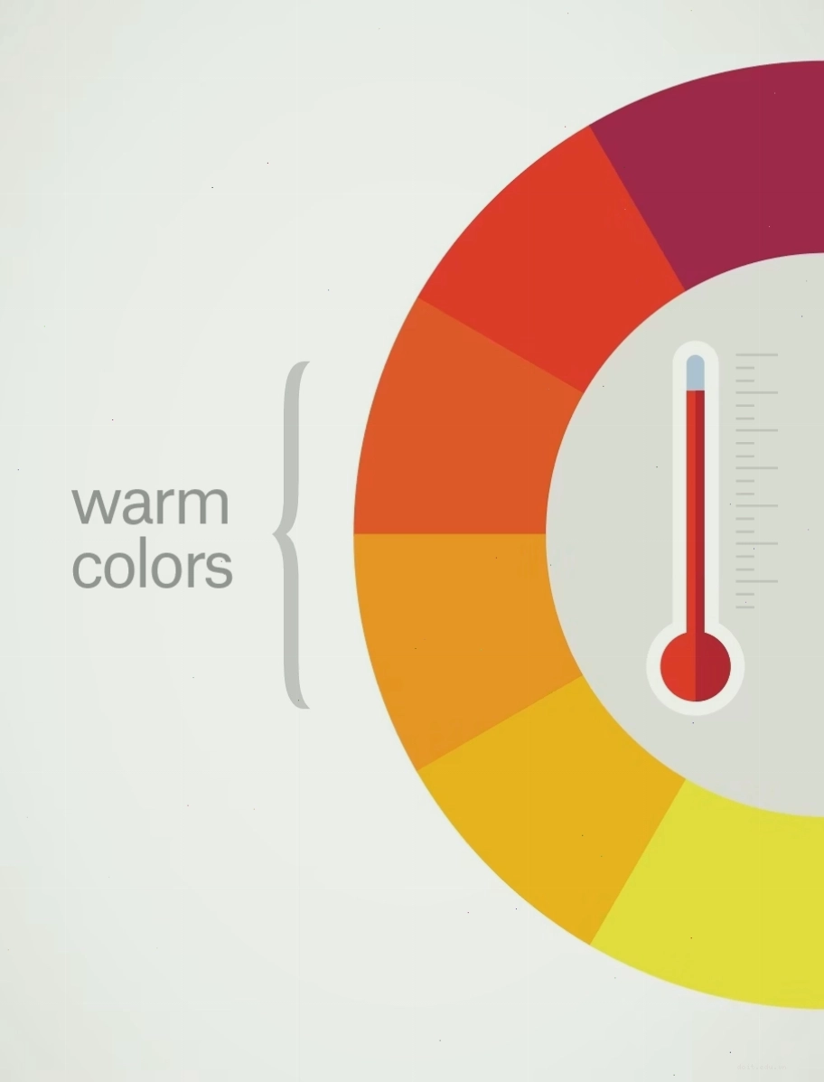
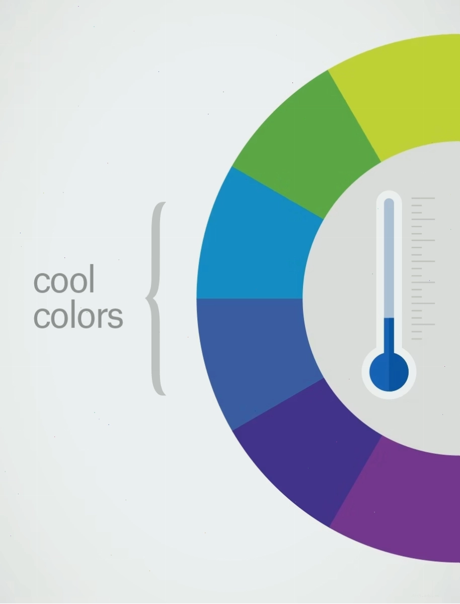
- Color Temperature: Warm colors (red, yellow, orange) evoke energy, while cool colors (blue, green, purple) promote calmness.
Understanding the Color Wheel
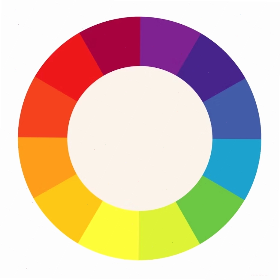
The color wheel is an indispensable tool for comprehending the foundational elements of color theory. It visually represents the relationships between colors, enabling their appropriate application in design. Primarily based on Isaac Newton's visible color spectrum, the standard color wheel features twelve hues, meticulously arranged into three primary categories:
- Primary Colors: Red, yellow, and blue. These are foundational as they cannot be created by mixing other colors.
- Secondary Colors: Green, orange, and violet. They are formed by combining two primary colors.
- Tertiary Colors: These, such as red-orange or yellow-green, arise from mixing a primary color with an adjacent secondary color.
A solid grasp of these relationships is paramount for effectively utilizing color in your designs. Understanding these color theory basics for beginners is the first step towards mastering visual communication.
Exploring Color Properties
Every color possesses three core properties that significantly influence how we perceive it: hue, value, and intensity. Recognizing these properties is key to creating and implementing effective color palettes.
- Hue: This refers to a color in its purest form and also indicates its position on the color wheel.
- Value: This describes the degree of lightness or darkness within a color. Value can be modified by adding white (tinting), gray (toning), or black (shading).
- Intensity: Also known as saturation, this refers to the brightness or dullness of a color. A color is at its most intense in its pure hue form and loses intensity when mixed with complementary or neutral colors.
For those seeking detailed explanations, resources like 'color theory basics pdf' can offer in-depth guides on these properties and more.
Creating Visual Interest with Color Harmony
Color harmonies are deliberate combinations of colors designed to create aesthetic appeal and visual interest. These schemes establish a sense of order and organization within a design. Different types of color harmonies include:
- Monochromatic: Utilizes various tones, shades, and tints of a single color.
- Analogous: Employs colors that are adjacent to each other on the color wheel.
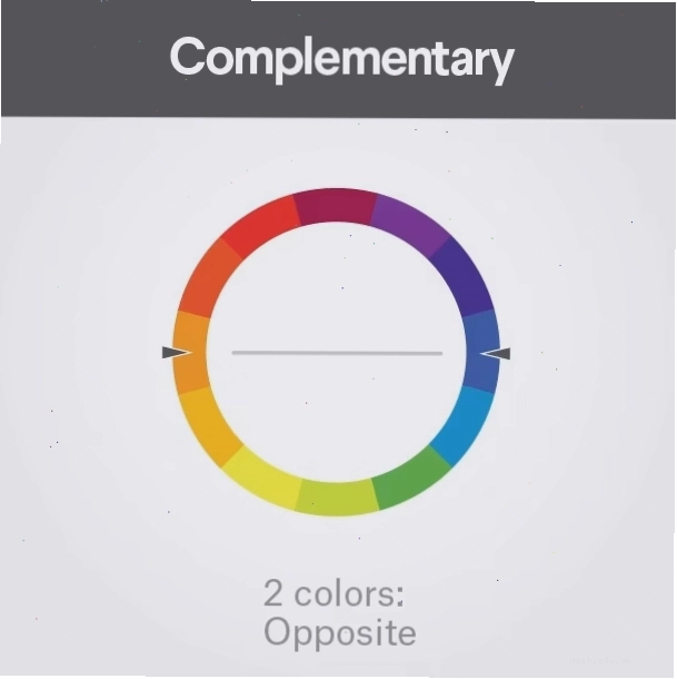
- Complementary: Uses colors positioned directly opposite each other on the color wheel, creating high contrast.
- Split-Complementary: Selects colors on either side of a color's direct complement, offering a less intense contrast than complementary schemes.
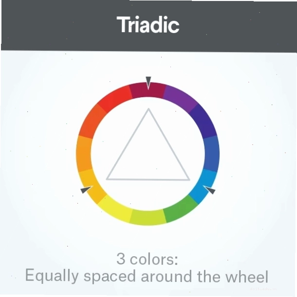
- Triadic: Involves three colors equally spaced on the color wheel, forming a triangle.
- Tetradic (Rectangular): Utilizes two complementary color pairs, forming a rectangle on the wheel.
Understanding these harmonies is vital for creating balanced and engaging visual compositions. For fans of specific approaches, searching for 'color theory basics sarah renae clark' might reveal insights into her favored techniques.
The Impact of Color Temperature
Colors possess the ability to evoke emotions and set a specific mood. Color temperature categorizes colors as either warm or cool, influencing the viewer's emotional response.
- Warm Colors: Such as red, yellow, and orange, are associated with energy, passion, and warmth, often reminiscent of the sun or fire.
- Cool Colors: Like blue, green, and purple, tend to evoke feelings of calm, relaxation, and serenity, drawing parallels to water or nature.
Additive vs. Subtractive Color Mixing
Two primary models govern how colors are mixed: additive and subtractive.
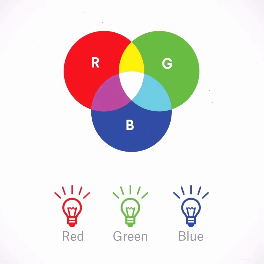
RGB: The Additive Color Mixing Model
The additive color mixing model, often represented by RGB (Red, Green, Blue), involves mixing light. When red, green, and blue light sources of varying intensities are combined, other colors are produced. Adding more light results in brighter colors, and mixing all three primary colors of light creates pure white light. This model is fundamental to digital displays, such as televisions, computer screens, and projectors. Maintaining the correct color process, like using RGB for screen-based files, is essential for brand consistency; for example, a bright yellow logo will appear muddy if not rendered correctly.
CMYK: The Subtractive Color Mixing Model
The subtractive color mixing model, commonly associated with CMYK (Cyan, Magenta, Yellow, Key/Black), is used for physical surfaces like paper, signage, and packaging. This model involves subtracting wavelengths of light. Most people are more familiar with subtractive mixing, as it's the basis for printing processes. Understanding the distinction between RGB and CMYK is vital to ensure colors appear as intended across different mediums.

Why Color Theory Matters in Branding and Design
Color plays an overwhelmingly significant role in consumer decision-making. Studies indicate that people often decide whether they like a product within 90 seconds, and a staggering 90% of that initial judgment is based solely on color. Color is a powerful perceptual tool; our brains interpret the wavelengths of light reflected by objects as specific colors. For businesses, this means that a deliberate focus on color in branding is not just an aesthetic choice but a strategic imperative. A well-chosen color palette can significantly enhance brand recognition and positively influence purchasing decisions, making the principles of color theory basics indispensable for any brand's success.
Whether you're designing a logo, a website, or packaging, applying the principles of color theory ensures that your brand communicates the desired message effectively and makes a memorable impact.
Key Takeaways for Applying Color Theory
Mastering color theory isn't just about knowing the names of colors; it's about understanding their interactions and emotional impact. By internalizing the concepts of the color wheel, color properties, harmonies, and temperature, designers and marketers can create more compelling and effective visual experiences. Remember that color is a critical factor in perception and decision-making, so leverage its power strategically to build a strong brand and achieve your communication goals.



Bình luận